5 minutes reading time
Nudges are everywhere; they are the little cues or prompts that encourage us to take a specific journey or path. Many we encounter are innocuous, invisibly informing our opinions and influencing our behaviour. Cast your mind back to the last time you saw a nudge, something you understood to be an attempt to influence you.
You may have been walking past a pub on a hot day and saw a sandwich board with ‘Beer garden and ice cold Fosters’ written on it. Did a waiter tell you about the specials unprompted? Did an airport pathway force you to walk through duty-free?
These are all real-world examples, but it’s in the digital sphere that nudges come into their own.

Online nudges work hand in hand with good UX – helping you get to where you need to be on a site or allowing you to complete a purchase in as few steps as possible. They align with persuasive design principles – aiming to steer users’ attitudes, behaviours and decisions to get them to the best possible outcome. There is, however, a yin to the yang of nudges and persuasive design – ‘Dark Patterns’. They are psychological tricks that go beyond nudges to influence decision-making and cause us to do something we may not otherwise do, such as automatically subscribing to a subscription service.
Persuasion architecture or ‘Nudges’ can use the same techniques as dark patterns - the main differentiator is the level of pressure applied.
Meatball notifications and variable rewards
Meatball notifications appear when we are already a user, giving you a reason to check the app and letting you know that there has been quite a lot of activity whilst you’ve been busy being productive or having some well-deserved rest.
Most of the time, the purpose of a meatball notification is to let us know that somebody has interacted with us directly, commented on our post, liked something, or sent a message. These alerts are beneficial: we don’t need to hunt through our history and check each post to see how well it’s performed or scroll through messages to see who has replied – at a glance, we have all that information delivered.
Meatball notifications train us to have this positive perception. Once we make that connection, it can be exploited and used as a dark pattern through pseudo-notifications.
They tell us nothing of direct value or that directly influences the user. You click under the assumption there has been interaction with your page, but there has not. Instead, the notification tells you that it’s somebody’s birthday or that a friend has posted a status for the first time in a while – a cleverly designed alert has quickly become a manipulative dark pattern.
Push notifications
Push notifications display information directly; they appear at the top of our device with a header and a short message, much like a text message or email preview. As the name implies, these are closer to a push than a nudge. Unlike a meatball notification which tantalises us with the lure of unknowns, a push notification carries information directly, though usually just enough to get us to log onto the app it came from.
Push notifications certainly have their uses: when your favourite band has a gig in your area, it lets you know tickets are about to go on sale, and you’re happy for them; or it shows you who a message is from and gives you a clue as to the contents to help you decide whether to focus on it now or later. They’re a nudge helping you achieve an initial goal or an ambition. They also excel when timed correctly: a news site sending you a push notification when you’re bored on a commute works well - you’re not busy and have time to kill.
But sometimes, we are bombarded with them. When this happens, we often ignore them, to the detriment of other apps using them. They no longer help us achieve an aim, they don’t display useful information, they only exist to get us on the app, like a gaming app reminding you that you haven’t used it in a week or so, to try and bring you back into the fold. The technique has transformed from a useful nudge into a Dark Pattern, albeit lacking subtlety.
The long goodbye
A key heuristic of web design is allowing for errors, you don’t want users to make catastrophic errors lightly, so it’s important to have a safety net in place. For example, if the ‘delete your account’ button for a site featured prominently on the home page, and after clicking, it did not have a fail-safe to confirm your intention, that would be phenomenally frustrating.
With this in mind, a site or app checking our choice is useful. We get the option to confirm our selection, and the app has a chance to persuade us to stay – a nudge that benefits both parties.
However, there’s a dark side: being trapped in a maze of return pages and pleas for another chance. This process is known as a roach motel. Companies are wising up to emotional manipulation by encouraging you to sign up and then guilting you into staying.
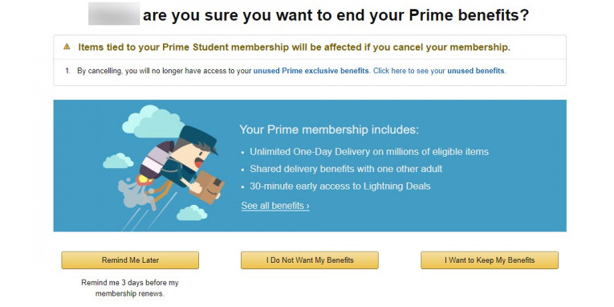
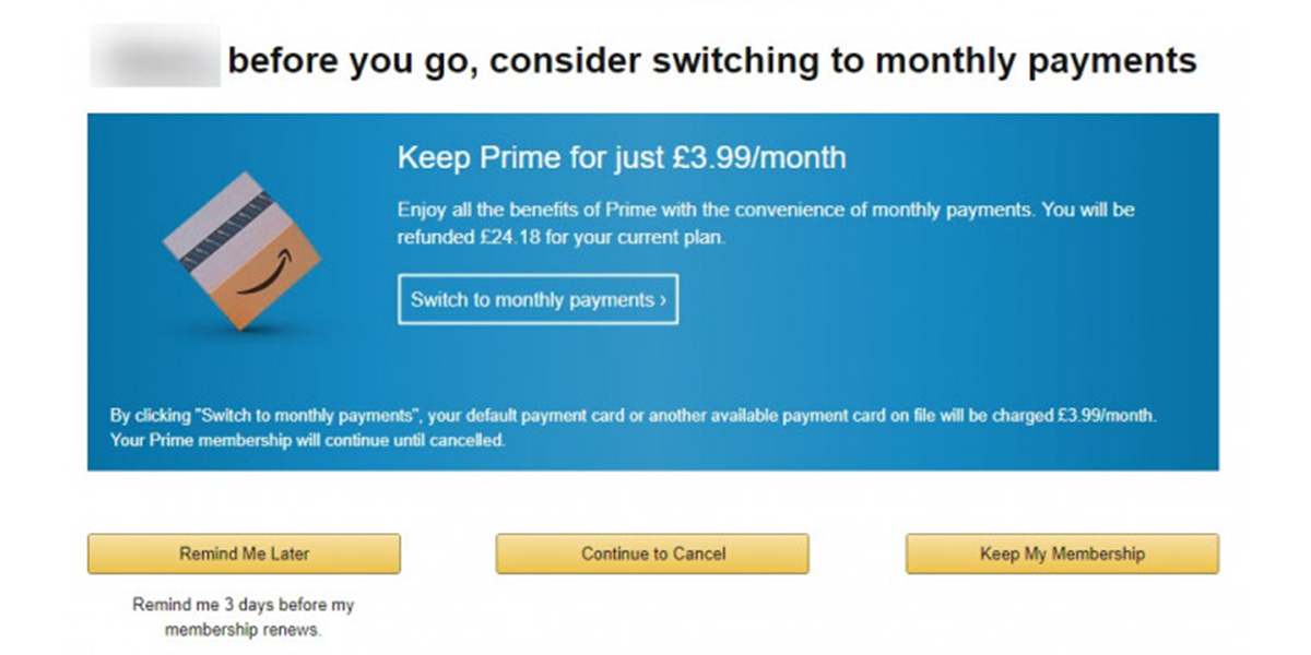
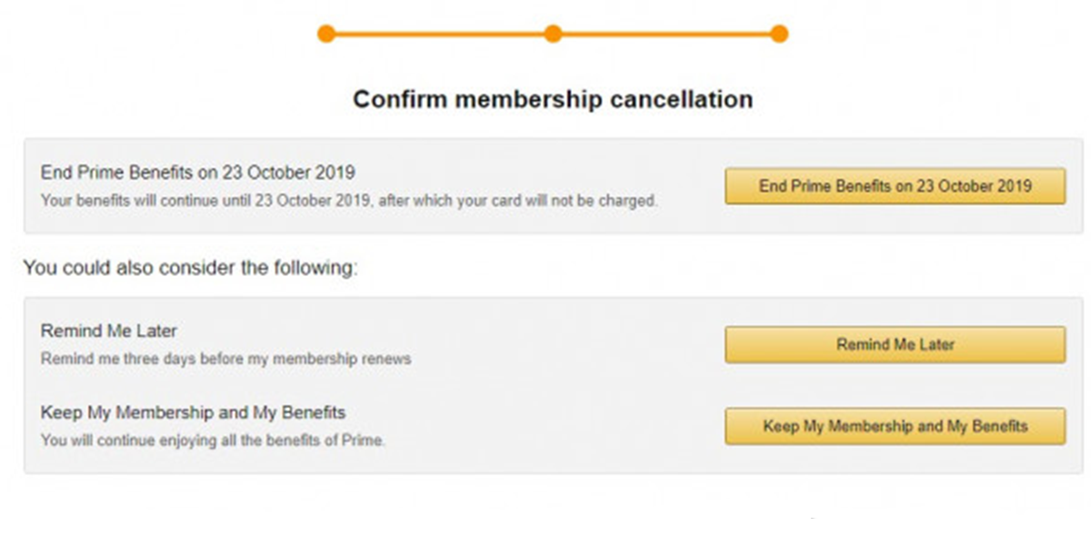
Amazon, for example, makes it especially attractive to sign up for but difficult for you to unsubscribe from their Prime service. After completing a free trial, they automatically convert you to a paid membership and start taking payments without any reminders. Once you realise the payments are being taken, Amazon takes you through three steps before completing the unsubscribing process. By reminding you of what you’ll be missing and tactically adjusting the page hierarchy, a simple un-subscription has soon become an awkward task – yet another dark pattern.
Step 1: Amazon tries to remind you of the benefits you will be missing out on.
Step 2: Amazon offers monthly payments as an alternative to a year-long subscription.
Step 3: Final confirmation of Prime subscription ending.
The internet is an ultra-competitive market, with apps and sites that no longer meet users’ needs fizzling out. Nudges are a weapon in the fight for survival which, when used well, can be of immense benefit, streamlining journeys and keeping us up to date with relevant information.
When pushed too far, they can become manipulative and frustrating.
When designing an app or website, it’s important to empathise with the user, or better yet, speak to users and test with them to understand when your nudge has become a shove or when an attempt to keep a customer turns into a maze of confusion.
 Author