 3 minutes reading time
An in-page tab is a go-to method to categorise content on a page without overwhelming users with too much information at once. However, many developers commonly misuse this functionality on websites and apps. This article will provide eight examples of best practices regarding in-page tab design and how to implement these successfully.
1. Indicate the active tab and ensure it is relative to the content below.
Users should be able to understand which tab is selected and which heading relates to the content shown. To differentiate the tabs, use high-contrast colours or bold headings. If your goal is to improve accessibility, highly contrasting colours between the active and inactive tabs make it easier for low-vision users to identify. This is also important when there are only two tabs on the page: evidence from user research states that users are often confused about which tab is currently active when the design is not prominent – causing users to question where they are on the website.

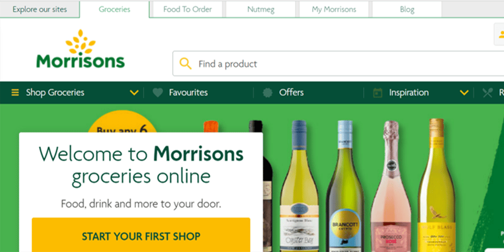
2. Keep tabs separate from one another, and ensure they appear as separate buttons to interact with.
Displaying tabs as separate buttons help users understand each one contains different content. If these look flat or are touching, this quickly becomes unclear. We have observed users scan over tabs like these, mistaking them for headers on the page rather than separate tabs to engage with.
3. Ensure the inactive tabs are still visible against the background.
Visible tabs help users navigate between views to display a different set of content. When the colour blends into the background, users miss the inactive tabs. If tabs go unnoticed, valuable content is at risk of being overlooked.
4. Use title case for tab headings rather than capitals.
In the title case, the first letter of each word is capitalised and the rest is written in lowercase. This format helps users scan their options as they are easier to read.
5. Keep tab headings concise but ensure they are still meaningful, consisting of one word if possible.
Short headings written in plain language make it easier for users to scan the headings – especially when there are multiple tabs. Using icons can help visualise content for users, allowing them to understand the type of content that each section contains.
6. Keep the tab design visually consistent.
Tabs on the page should all look like they belong to or relate to each other, as the content falls under a larger category. This way, users are more likely to understand that content has been broken down into separate sections and know to navigate between tabs depending on what content they are interested in seeing.
7. Place tabs at the top of the page and keep these in one row rather than at the side or bottom of the page.
As users naturally scan the page from top to bottom, the placement of tabs at the top will meet user expectations and avoids making users look in unusual places for hidden content. It is also consistent with the visual hierarchy of headings and content on a page.
8. Always have one tab preselected as users arrive on the page.
Without this preselection, users may feel lost on the page and unsure how to get started. The pre-selected tab should be one that users are most likely to engage with, as this reduces the effort users need to put in by having the content readily displayed.
Tabs can be an excellent user interface design to divide content into sections without taking up too much space on the screen. However, when in-page tabs are implemented poorly on websites and apps, users miss important content and struggle to carry out tasks, impacting the user experience. If you follow best practices, tabs can be an effective tool for users to see different content they are interested in whilst keeping the page tidy.
If you are looking to improve user engagement with your website, please get in touch with our friendly team.
 Author