 4 minutes reading time
Mega drop-down menus have consistently been endorsed in the world of UX, by experts such as Jakob Nielsen, for their ease of use – becoming the most popular choice for most retailers. Unlike a regular drop-down menu, a mega menu offers several features that enhance the user experience – they provide the ability to see all of the site’s content and easily understand the relationships between categories through subcategories. Research by Jeff Sauro suggests that at any given time, 68% of users on your site are likely to be browsing, while only 16% are actively making a purchase. This statistic underscores the importance of having a website with smooth navigation.
Categorising your mega menu
Simply displaying all available options to users is not enough – it is essential to provide clear visual cues to help users navigate seamlessly through the mega menu. Structuring a long list of options into categories and subcategories with distinct subheadings keeps users engaged by allowing them to browse the different sections of your website that interest them. Research by Jeff Sauro has shown that better website navigation increases the average order value on products across websites; spending time on the organisation of the menu navigation pays off.
%20SVG.svg)
Argos performs well in the organisation and design layout of its mega menu. It does this by using clear subheadings displayed in a larger underlined text to separate each column of options. While the subheadings and following links are not alphabetised, they are ordered based on the most popular products on the Argos website, helping many of their users quickly find what they are looking for.
Using images and icons to draw attention
Including images in mega drop-down menus can be beneficial for user experience, but only if the images are relevant to the options available within the menu. Continuing from Jeff Sauro’s study, he argues text associated with images is more effective than just displaying text or images alone. Therefore, placing images or small icons near the information you want to emphasise can improve mega menus –the Disney Store mega menu, shown below, is an excellent example of this.
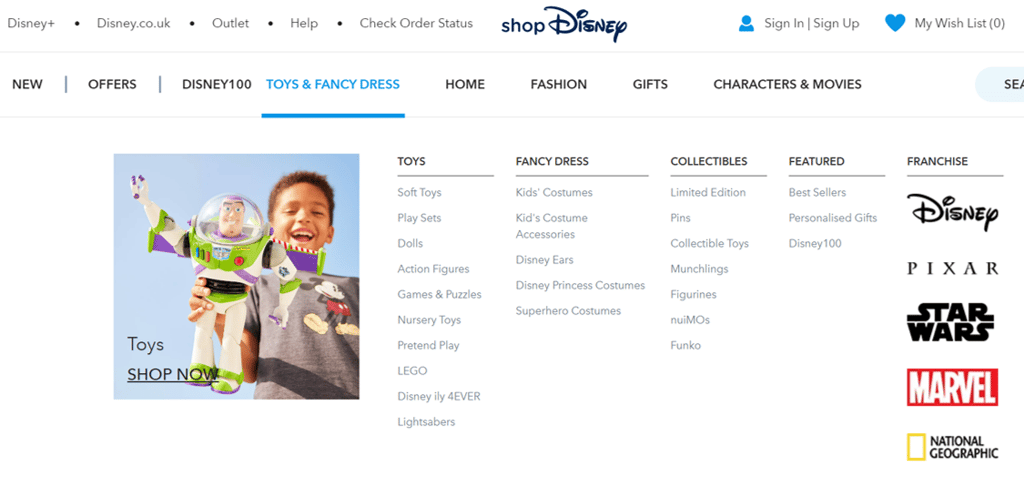
By using popular Disney characters, appropriately labelled to distinguish different categories, the user’s attention is drawn directly to products – even those they may not have originally intended to buy, thus improving the website’s up-selling potential.
The Disney Store also uses images to differentiate brands within its menu. Using recognisable and established brand logos helps users locate products faster than they can by scanning standard text.
Too many options can become overwhelming
It can be tempting to turn mega drop-down menus into sitemaps, allowing users to see every available option on your site. However, this approach can result in decision paralysis for users presented with an excessive number of options.
While incorporating a site-wide mega drop-down menu may seem like an easy solution for designers and site architects, it can reduce user engagement on your site.
It is important to take the time to understand how users would organise your website content, then check these navigation structures with tree tests to ensure your menus are usable.
Small screen considerations
Visitors who browse your website on their smartphone can run into trouble if they encounter a mega drop-down menu. These menus can become completely non-functional if the window is too narrow, such as on a mobile device, where only a fraction of the menu is visible. There are several options to overcome this issue.
One quick fix is to make each top-level link clickable and redirect the user to a regular webpage with all the possible choices displayed. Alternatively, you could detect which device the user is visiting the website on and load an optimised version of the site for that device. For example, mobile users could view a mobile-friendly version of the site that does not include mega drop-down menus.
If you’re looking at optimising your site for mobile devices, consider the advantages of making a mobile-specific or responsive website. Nielson Norman outlines some of the benefits of both methods.
Accessibility considerations
Mega menus can present challenges for some users, particularly those with low vision using screen magnifiers. As these users are only able to see small portions of the menu at any time, they may be unaware of the scale of other content included, resulting in missed opportunities for potential orders.
Screen reader users may also become frustrated with mega menus due to the large amount of text they must scan before being able to locate the category they are interested in. One way to alleviate these frustrations is to incorporate keyboard shortcuts that move through the mega menu. However, both low-vision and screen reader users may prefer hierarchical menus that allow them to scan through shorter sub-menus in a more manageable way.
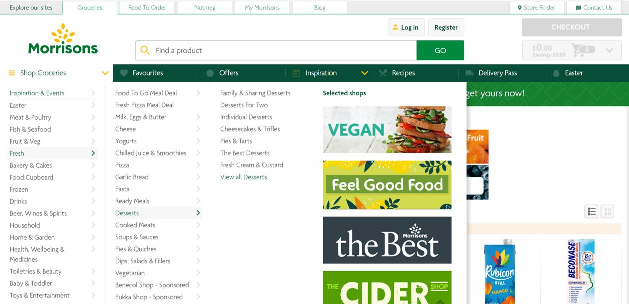
Grocery websites such as Morrisons (shown below) balance the benefits of showcasing a range of categories whilst also being able to navigate shorter sub-menus.
Mega drop-down menus can be beneficial for your site: helping users browse through a range of categories and explore all your website content. However, it is important to keep in mind that this design is not a fit-all decision and not the only navigation option available. Early research with users to organise your content and test design will inform the best decision for your site.
If you're looking to conduct user research, please get in touch with our friendly team.
 Author